Brief
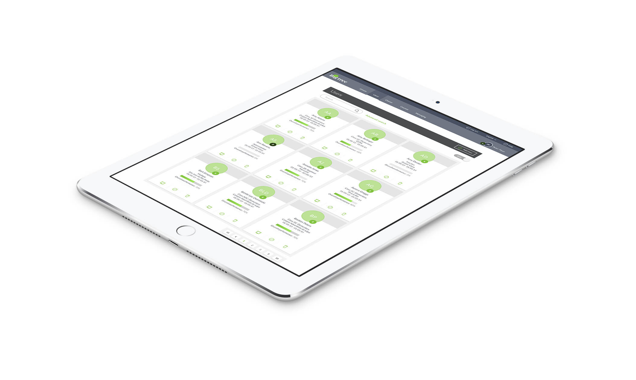
I was brought in to Macmillan to design a new learning management system (LMS) that would act as a launching pad for language learning content, allowing students to access and interact with lessons in an adaptive learning environment.
The LMS also needed to provide set functions for teachers, such as reviewing and marking work, as well as complex functions for administrators such as class setup, user management and a large analytical piece for generating reports.
Working closely with the project’s Business Analyst, Product Owners and Stakeholders, I built three fully interactive prototypes based off business requirements, results of user testing and closely related e-learning products already on offer from Macmillan.
Once these prototypes were signed off, I completed the UI design for all three user types.
Challenges
One of the greatest challenges of the project was incorporating all the many stakeholder 'wants' as well as the business requirements into one single usable product in the most time efficient way possible.
Gamification
An idea that had been 'sold in' early on to the institutions the product was aimed at, was an element of gamification around the progression of a student through the content.
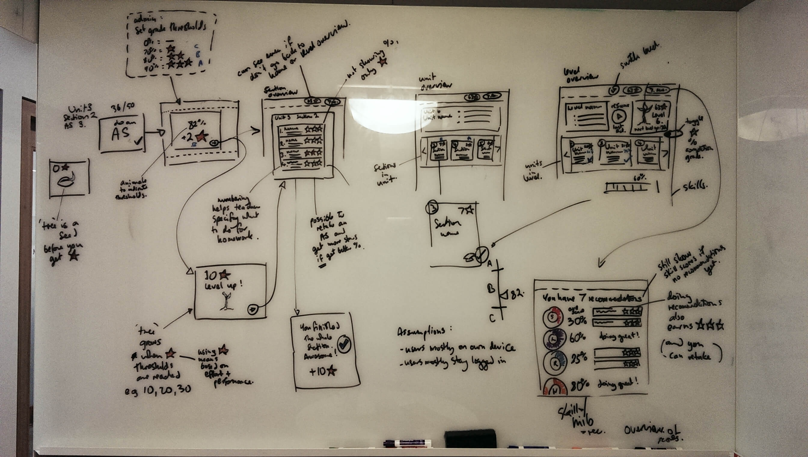
Workshop whiteboard sessions proved to be invaluable when tackling gamification aspects of the product and in understanding how this could benefit and motivate the user. Driving the user to access more learning content was an important focus for stakeholders.

Users
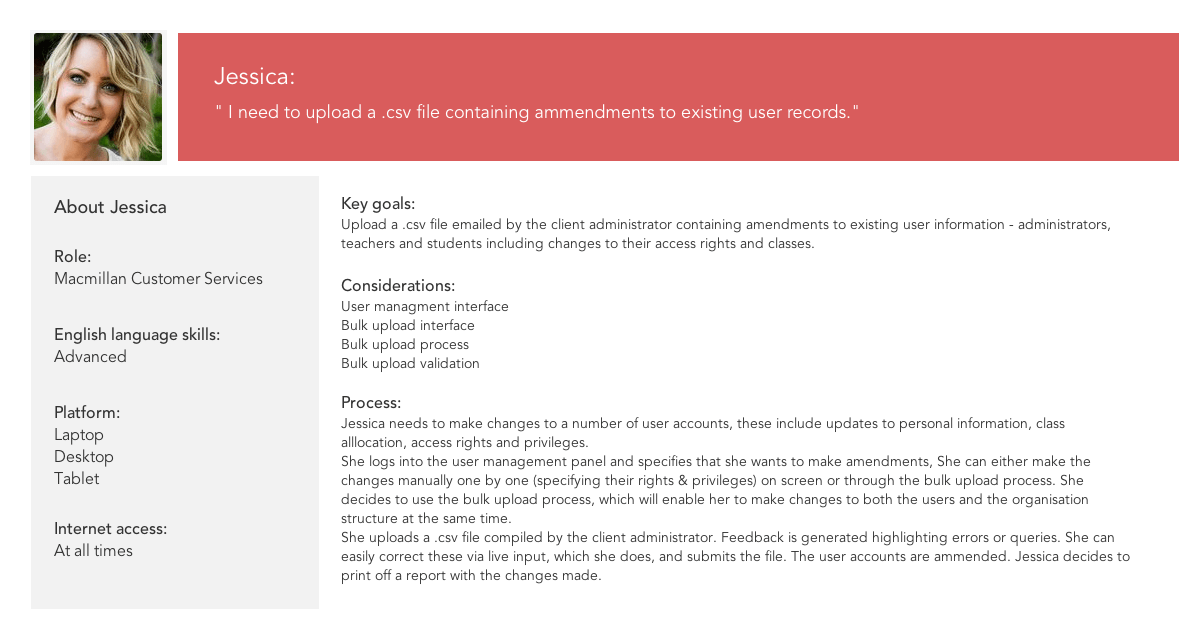
Understanding each user type was integral for the sucess of the product, each user type had different motivations and completely different types of tasks needing completed. Fleshing out these user tasks/ stories before beginning the wireframing process ensured nothing was missed.
User Stories example

Prototyping
I created three fully interactive prototypes in Axure RP for the three different user types: student, teacher and administrator. These were annotated to include interaction types as well as any design decisions made on assumptions - so to clarify these later on based on institutional feedback.
You can access the administrator prototype here


Design Rationale
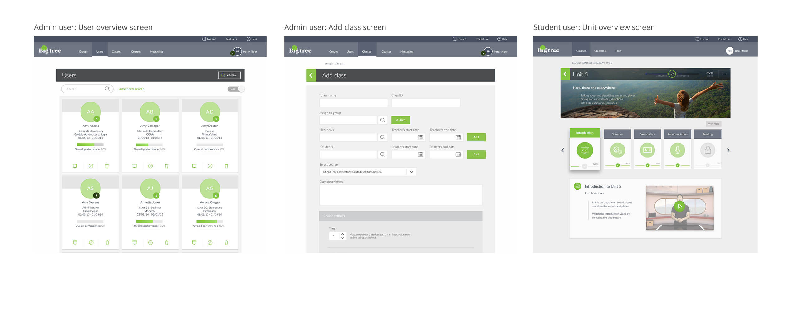
The UI design of the LMS needed to take Macmillan's own 'Bigtree' branding as well as a nod towards a previous online product that was simultaneously going through a redesign.
The use of icons needed to stay consistent through both products as many students using Macmillan's existing product 'Jura' were likely to complete further learning through the LMS.
Colours worked best to create focus on important information within the screens, whilst neutral background tones and tactile like 'cards' created visual space and containment of information.

LMS Style Guide
On completion of all UI work I produced a 14 page LMS Style Guide, outlining design choices and particulars for reference and/or further design work.


